Before going back to graduate school, I worked in advertising design and public communications. Other than the Les Paul illustration below, the images on this page were created while pursuing my PhD. None of these were paid for but all done as part of service for an organization I’ve been involved with.
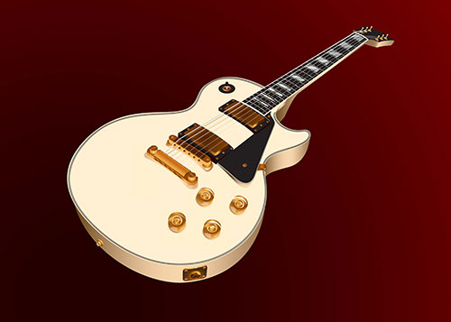
This is one of older digital drawings, probably done to commemorate Les Paul’s birthday. Most likely done while working as a photo editor.
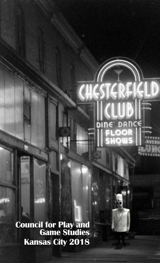
Posters
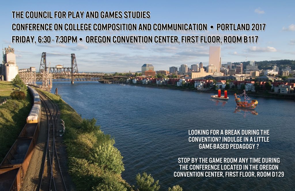
As the publicity person for the Council for Play and Games Studies, I had a lot of fun creating these posters. Started with a cool, open source image and added some game elements that matched.
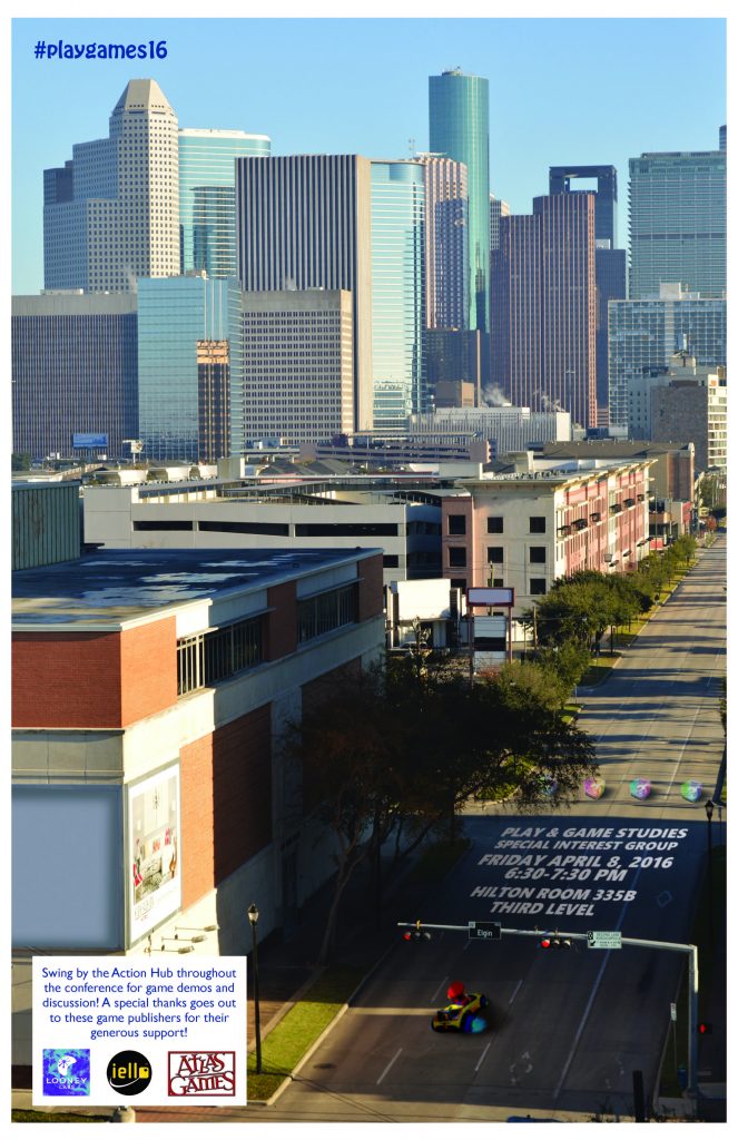
I’ve done a lot of posters during my time in academia. As one of my cost-cutting efforts as chair of the Midwest Interdisciplinary Graduate Conference (MIGC), I designed all of the outreach materials. I’m not crazy about the poster to be honest: too dark and the circle insets/US 101 font combination are a recurring design theme that runs amok for a couple years after.
Still, the MIGC logo in the lower right-hand corner was an original creation as well. MIGC logos up until this point had been exclusively black and white. Because I was adamant that the conference would be a bit more optimistic in tone that year, I figured a little color in the logo wouldn’t hurt.
Logos
I’ve done quite a few logos over the last few years as well. None of them are particularly fancy but all were done voluntarily with little time to devote to their development. First up is a better version of the MIGC logo.
This is a logo designed for the I/0 section of cream city review, which features print-digital hybrid works.

An early logo done for Jamie Madigan’s website. Can’t recall how we crossed paths but a few people have mentioned the logo to me – not even sure how they know it was me that created it. This was actually a mock-up that was going to be full-color but Dr. Madigan was fine with it as is. If I ever have time, I’m going to request he let me update this so the controller looks a bit more…conventional.
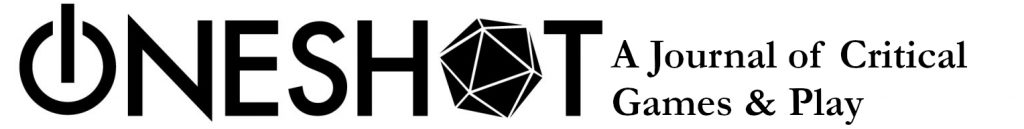
Another logo created for OneShot. I like this enough – just wish we’d called the journal ProtoType instead.
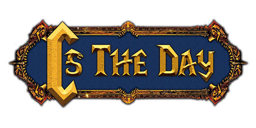
Love this logo. Unabashedly derivative of World of Warcraft but this was the theme of the previous logo as well. This was used for the table banner. A smaller logo (featuring only the “C”) was used for the playing card backs.
Here’s the logo for The Proceedings of the Annual Computers & Writing Conference. Why so many b&w logos? Mostly because of printing costs. Partially because adding color schemes would also impose additional constraints design-wise that I often don’t have a lot of time for. Did I mention all of these are done voluntarily?
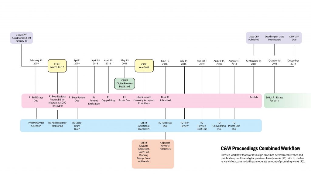
Workflow Development
Speaking of The Proceedings, here’s a workflow timeline I developed for our first publication. Visualizing these extensive projects is extraordinarily helpful. It’s odd that project development principles aren’t taught alongside research methods. They should be. A PDF version can be viewed here.